


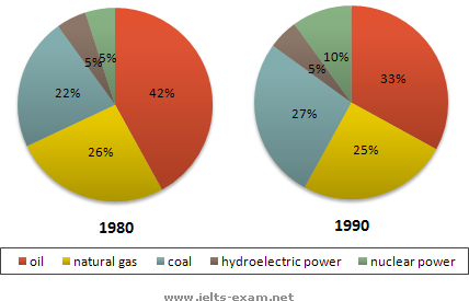
The pie charts portray the main sources of energy in the USA. The pie charts are recorded in 1980 and 1990 which vary oil, natural gas, coal, hydroelectric power and nuclear power.
First of all, oil was the largest slice of the pie charts as the main source of energy in the USA. The percentage was 48 per cent in 1980. Although the percentage declined slightly to 33 per cent in 1990, oil still the largest proportion among the other main sources of energy. On the other hand, hydroelectric power remained the same in the both years. The percentage was 5 per cent in 1980 and 1990. It was the smallest proportion compared to the other slices, indicated in the both pie charts.
Generally, the biggest proportion illustrated in the pie charts was oil in 1980 and 1990. Meanwhile, among the other main sources of energy, hydroelectric was the smallest slice in both years.
0 comments:
Post a Comment